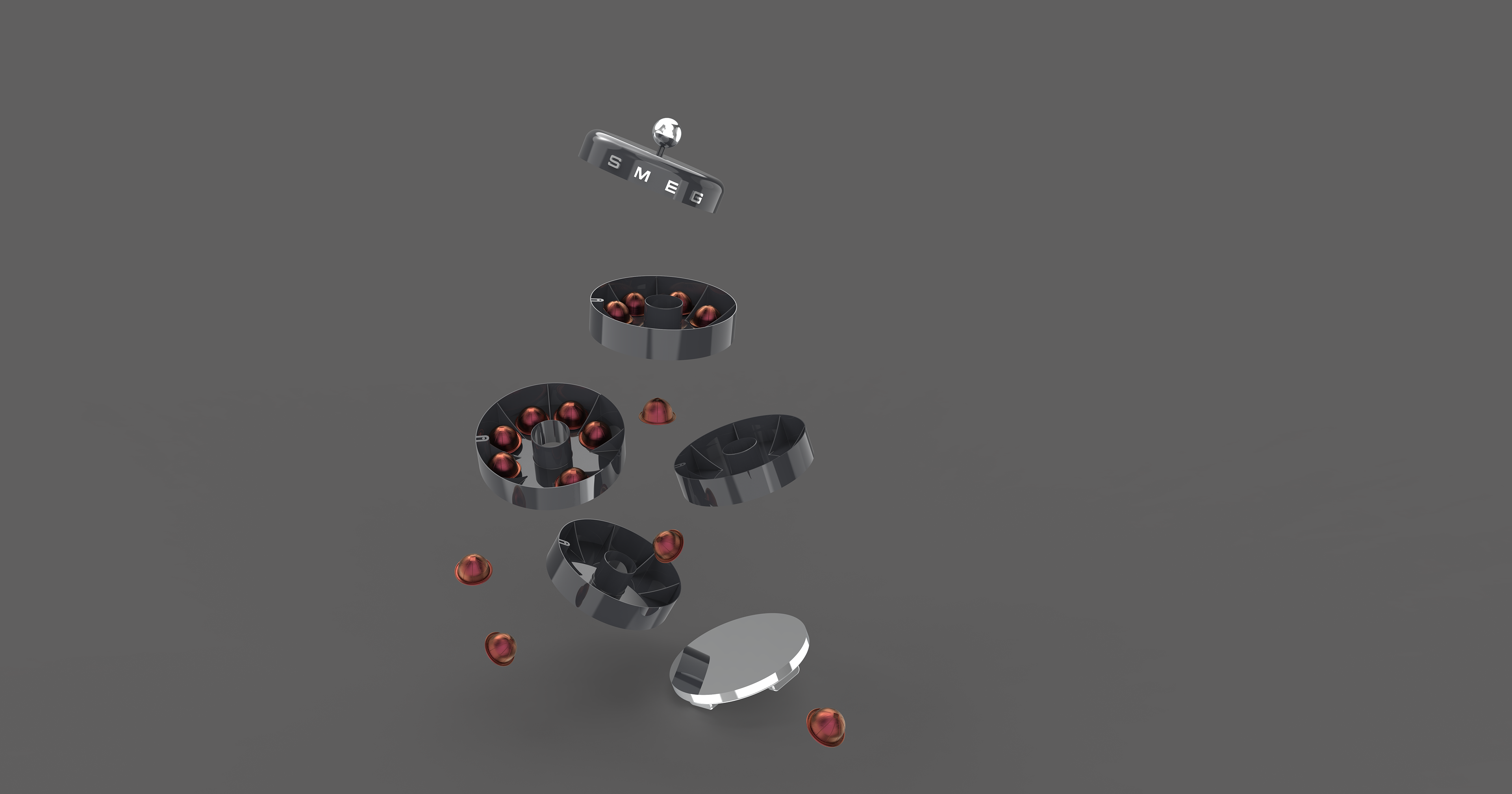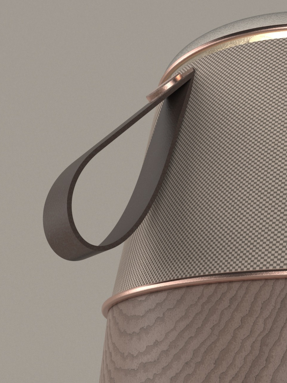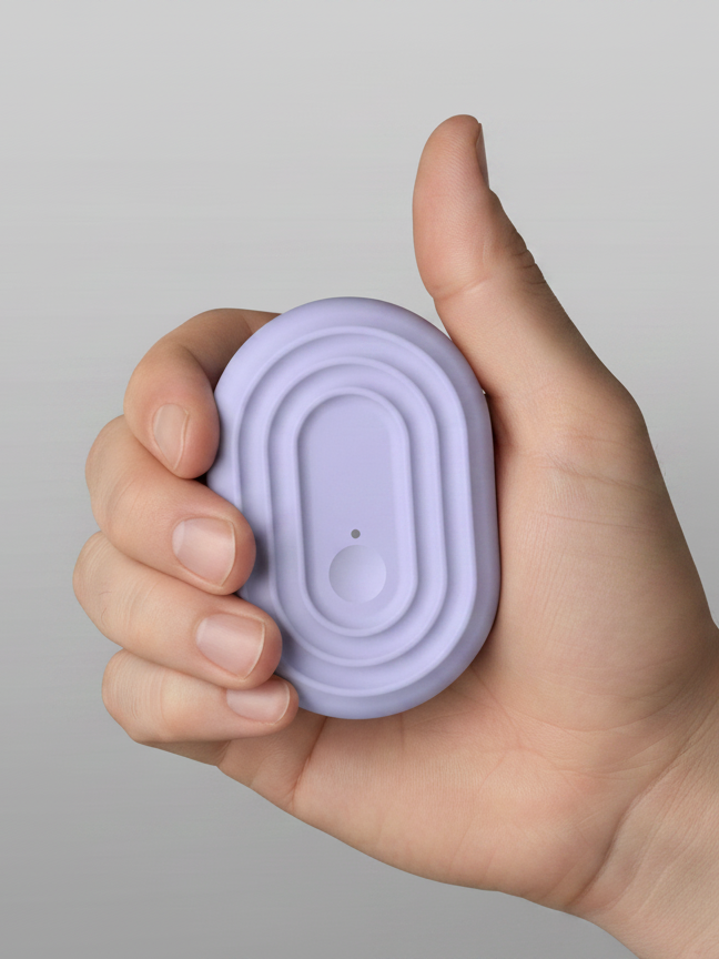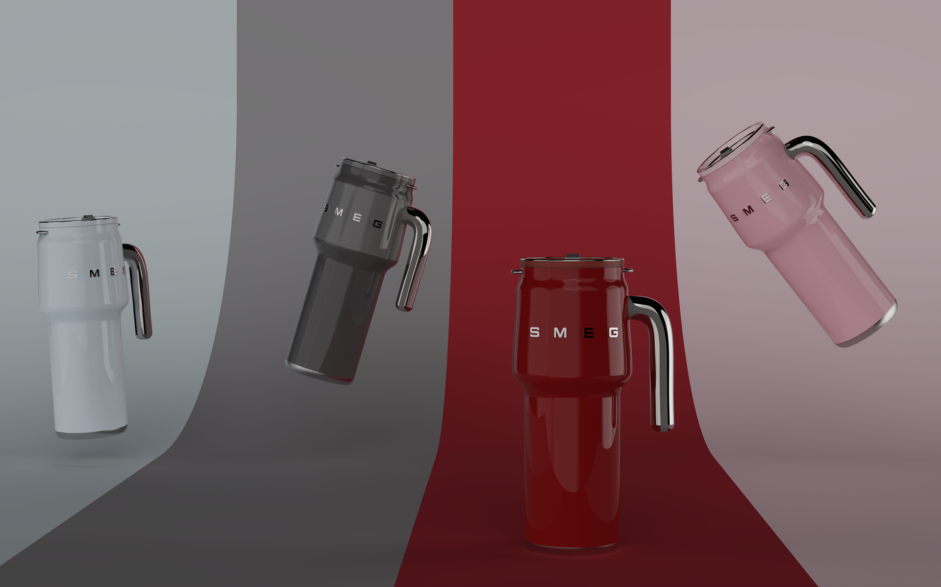
For this project, I designed a product inspired by SMEG's iconic design language, balancing functionality with a bold and playful aesthetic. Through research, sketching and concept development, I explored how strong branding and thoughtful design can create products that are both practical and visually distinctive.
Brand analysis.
Smeg’s brand aesthetic is recognised for its distinctive combination of retro-inspired forms, playful colour and contemporary functionality. My design explored these characteristics while developing a modern interpretation of the brand, using bold forms, considered proportions and a refined material and colour palette to create a product that feels unmistakably Smeg while remaining relevant to the contemporary kitchen.
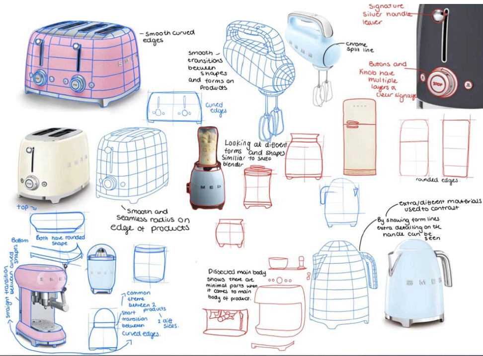
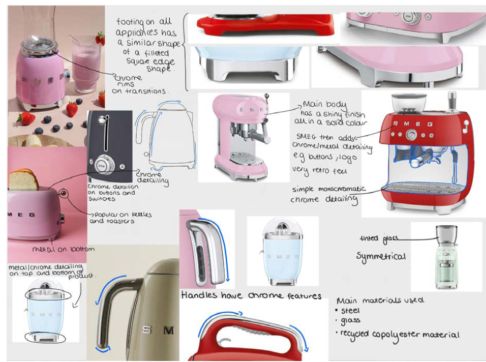
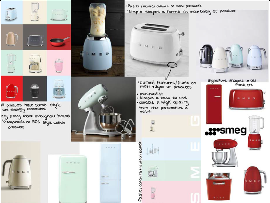
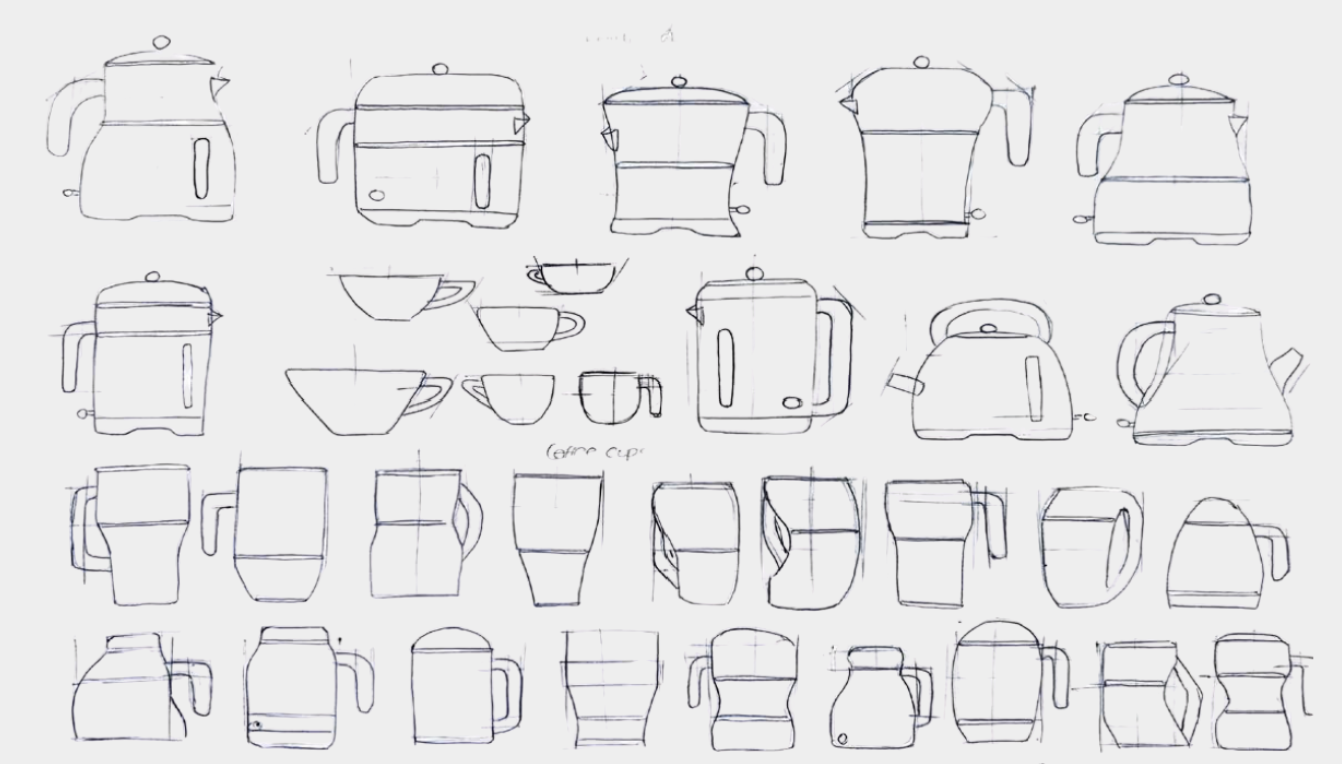
I used sketching to explore different forms, proportions and design directions, allowing ideas to be developed quickly and refined throughout the design process. This helped me establish the final form while staying consistent with Smeg’s distinctive design language